Thursday, May 30, 2013

Shaders and Textures Final (TECH 311), part 1

Another sleepless night, but that is expected during Finals week at SCAD.

Today, I have for you all my final from my Shaders and Textures class.  In short, this is a class that teaches how to make objects looks really cool with textures and a realistic reaction to light.  So you'd think the final project in this class would involve making some photo-real objects, but it isn't.  In fact, it is quite the opposite.

Our final was to use a non-traditional shading technique to make something that looks 2D in a 3D world.  We aren't talking toon-shaders, but something more advanced.  Our in class assignment was to make it look like a drawing, and still have a reaction to light.  As you can see here, the sketchy pencil marks really help make this scene look drawn, but it is in fact 3D.

So for my project, I decided to do a painting.  Specifically, I wanted to make an homage to one of my favorite artists, Vincent van Gogh, and his most famous painting, Starry Night.  In order to make this project, I got the assistance of my beautiful wife to help me literally paint with Acrylics (because I don't have nor know how to use oil paints) onto Bristol board and scanned into a computer.  I then manipulated the scans, adjusting colors and tiling the images and such.  From there, I input them into Maya, did a lot of adjustments, and placed them inside various procedural textures which add a lot to the render to make it look like more than just a bunch of flat strokes.  The scene I chose to do is, in fact, a direct homage to Starry Night, which is not as well-put-together as I would like, but I will play with that later.

I am also working on animating this scene with a camera pan through the painting.  I tried this already, but I forgot to bake in some of the textures, which messed up the sequence.  Once I fix this as well, I should have a pretty cool short flying out of a painting.

So for now, enjoy my rendition of a 3D Starry Night.


And now... SLEEP!

Wednesday, May 29, 2013

Composition Final (TECH 420), version 1

Hey everyone!

I have 2 finals down, and (and a half) to go.  Why a half?  I have to take one of my projects and do a simple breakdown, but that's for another post.  For now, I have finished my final for my Compositing for Technical Directors class, which has been teaching Nuke, as I mentioned before.  Our final project was to take an existing live-action plate, which is essentially just a video taken of an environment (in this case) with the intent of adding a CG element to it later.  The CG element we could add was our choice, and I decided I wanted to do something a little different.

In the end, I am not satisfied with the level of detail the model is.  While I did a LOT of work to make it look better, including displacement, specular highlight, specular color, and more, which I did in Mudbox, Maya didn't properly import anything, and I had to fight with it to make it look halfway descent.  However, as a result, I spent to much time trying to fix bugs and errors that I had to stop fixing minor problems and get to the point of the project, which was to integrate the object into the scene.

A LOT of work went into this, but too late I ran into a bigger bug that I've seen before and couldn't figure out.  I'm not even sure how to describe it to get help, and I didn't have any time left to try to repair it or even remove it.  If you look at the object in my scene, it has a sort of polygonal look to it, but I assure you this is a smooth model with no polygonal edges on it.  The problem is the displacement I used fell apart.  I've seen this before, where my displacement lost all definition and became a mass of polygons on the surface that no longer even tried to retain it's original shape, but it only shows up on high resolution renders, so none of my smaller test renders caught it.  So I am NOT giving up on addressing this challenge.  I WILL fix this, and then I will post it.

So for now, enjoy my little scene, and again, if you have any feedback on how I can integrate the CG elements into my scene better (and please refrain from mentioning the texture, polygons/displacement on the object, or the clipping yet because I am already addressing those), I would appreciate it.  Ta ta for now...

Monday, May 27, 2013

Photography Final

So today, I delivered a presentation for my Photography final.  In short, my assignment was to research an existing Photographer, and as I mentioned n a previous post, I decided to research Michael Eastman.  Specifically, I decided to try to capture the feel of 2 of his projects, Urban Luminosity and Vanishing America.  My project is called City and Country, and is meant to show a contrast between images of the city life and country environment.

For the City side of my project, I took pictures around Atlanta, including the beautiful Hyatt Regency hotel, and outside The Loft.  In all, I took about 160 images of this set, but for the final project, I had to choose 5.  I already posted several favorites that didn't make it into the final project, and I may add some more later.  These images were all designed to focus on the transmission and reflection of light, with a low ISO for high quality, and long exposures to catch as much detail as I could.

For the Country half, I went to Pendelton, South Carolina,  where I visited the historic areas and went off the beaten path to a few other areas, including an old train yard that was falling apart and covered in rust.  It was my favorite place to take pictures, but I started to run out of time as the sun was setting and the last few images got too rushed.  In the end, I took over 200 images from Pendelton, and chose 5 for my final, although I will post more later that really loved but didn't make it into the project.  These images mainly focused on the textures and wear/aging of the objects and locations.

I did do Photoshop editing to these images as well, to try to match the aesthetic Eastman uses, or something similar at least.  For his Urban Luminosity, he would saturate colors, clean up the dirt/debris (but not completely), and present a clean and vibrant image with patterns and colors boarding on the edge of abstract.  I cleaned up the majority of my City shots where I removed distracting dirt/debris, while enhancing colors.  For Eastman's Vanishing America images, he would often darken and enhance the sky, desaturating it while increasing the contrast and details.  Other than working with the sky, I would apply a slight desaturation (using an adjusted "Black and White" adjustment layer at low opacity) and bringing details back into the highlights of the image.  There is a huge advantage to working in 16bit with camera raw, which allows for HDR images and really pulling in the details lost in shadows and highlights.  While none of these are actually HDR in my final, I did bracket my images which will allow me to get HDR out of them, and I did work with HDR on a few that didn't get into the final.  I will be presenting more of these later.

Enjoy!


Saturday, May 25, 2013

Soul Front

Hello again everyone!

I just wanted to tell you all about a project I've been helping out with for the ITGM (Game Design) guys.  Some of them approached the production club, looking for help with animation.  That's one of the nice things about SCAD is that you always meet students from other disciplines, related or unrelated to yours, and can collaborate to make a better project than what you started with.  For example, photography students will often meet with fashion majors to take pictures of the models wearing the fashions, to not only fulfill requirements they both need, but spread publicity for each other as well.  Well the same is true, maybe even more so, between Animation majors, Visual Effects majors, and Game Design majors.  While the game design guys aren't all in this building as often as animation and Visual Effects are, they do have their own little gaming lab where they test out games, and they have several classes in this building, so they are often around.

So the long and short of it is that a group of game design majors came looking for animators because they knew their animations weren't that great, and didn't have that time to finish the animation with them more important programming and testing they had to do.  That's where I stepped in.  With help from 2 other animators (Raymond and Andrew), we were able to put together new animations for all their characters.  With 4 characters, 7 animations each, plus tweaking and additional animations, we had a lot to do.  We haven't quite finished yet, but the animations are almost done.  Right now all the blocked in motion is there, and some tweaks are needed, but so far we have what we need for them to continue.

The game is called Soul Front, and it is a real-time strategy game where you control 3 characters (out of a choice of 4 archetypes) that you match up against another player (or a computer) with the same set up options as you have.  No out-leveling opponents here.  This is actually designed to be a mobile platform game, to work on the iPad and I believe Android.  Specifically, I coordinated the animations, working with Raymond and Andrew to decide what each character should do.  I then animated throw animations for each character, stunned/dazed animations for all of them, the attack and victory for one of them, and will probably be doing tweaks on many of the animations already finished in the future.  I will give more details about my role in this when the game is closer to a release.

While it is still in the works and might not be available for download yet, you can see their blog at SoulFrontGame.com.  Please check it out and make sure to check their Facebook and Twitter pages too for more updates.  I will also update here when the game is available for download.

Sera

Well I'm smack dab in the middle of finals, which is why I haven't updated in the last week.
However, I do have a lot of new stuff to show, and more coming soon.
So for now, since I am so busy, allow me to show a project I have been working on in a program called Mudbox.  This is like ZBrush, but easier to use.  This is not an in-depth look at either program, but it did help give an idea of how to do such a technique and where to go from here.
I decided to model a triceratops.  The original base model is one found in the Mudbox community, what I did was literally paint the 3D texture, color, specularity, and everything else, onto the model.  It is a technique called Texture Painting, and uses something called Displacement Maps, which I combined with Bump maps to create my image.
While I did bring this into Maya to render using Renderman, it wasn't as successful a transfer as I would have liked, so I am showing the mudbox file for now until i can get the renderman render to work properly.
I plan to go back and "dirty" it up a bit, and make more adjustments.
Enjoy!

And yes, this is based on the Triceratops in Jurassic Park.

And yes, I did name it "Sera" after the Triceratops in Land Before Time.


Friday, May 17, 2013

Finals already?

Hi all,

My lack of recent posts isn't a sign that I'm giving up, but it is a sign that finals are (already) here.  I have some good stuff to show, plus I'm working on taking more pictures this weekend and some more digital art.  This quarter has seemed to go by so fast, but I guess that's normal.
So for now, I am waiting to go into a museum for a class trip to look at renaissance art (yay!) and I'll post more this weekend.

Stay tuned!

Monday, May 13, 2013

Photo Preview

Today I have for you a preview of my final project in my photography class.

The final project in this class is to take a photographer (or other artist), and either try to mimic their style and work, or improve on it.  Since I would rather learn from others, and not show them up, I chose to mimic a photographer.  After much searching, my wife and I found Michael Eastman.  Michael Eastman began taking pictures in 1972, and his work is really impressive!  He has done a series of different subjects, from Americana to horses to abstract to Cuba.  His images have a certain aesthetic appeal I really like, and I find that his study of reflective, refractive, transmitting of light in a city at night is intriguing, bordering on abstract, but with a certain sense of place.  You look at things you see everyday in a new way, or at things people never notice at all that's right in front of them.

Usually his images are of textures and play of light.  I have to wonder how he gets into all these places, but I really enjoy his work.  I spent the better part of a weekend (with some planning beforehand) taking pictures around Atlanta.  Here is a preview of some of these images.

I will also be using a similar aesthetic to follow is Vanishing America series, contrasting the big city with rural country.

In the end, I have to pick a grand total of 10, so that's around 5 for each study.  But what I really care about in this is keeping consistant with te aesthetic and building some good photography samples for my demo reel.

Enjoy!


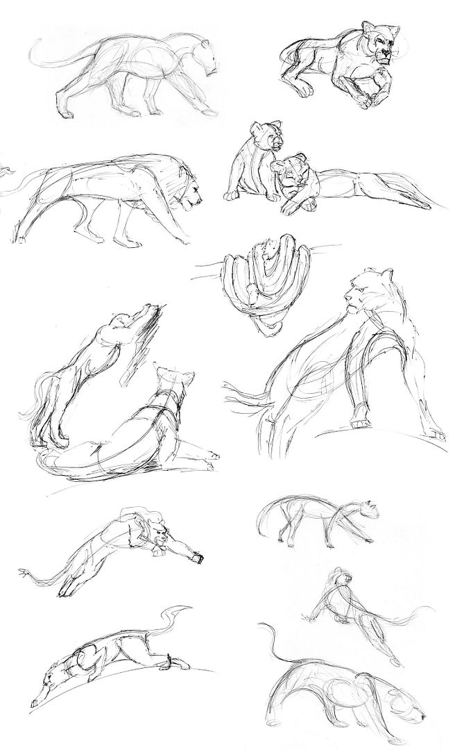
Animal Sketches

Today is a short post.  I leave you with some simple sketches of some animals I made a few months back.  Enjoy!


Saturday, May 11, 2013

New images soon

Just spent a day working on mudbox, compositing files together, and taking pictures around the city at night.  I'll have lots to show soon but for now, I'm beat!
Stay tuned for all of this plus a book review and more reviews of movies!


Wednesday, May 8, 2013

Bombs away!

So many possibilities with the name of this entry...  Duke Nuke-em, Drop the Nuke, Ground Zero, Nukes Away, To [insert enemy country here] With Love... you might notice a theme with them.

Today I want to talk briefly about Nuke, the compositing program by The Foundry.  In short, this is the program that most companies use to put all the different elements they create together.  It is also where they can add certain affects, which were impossible or unsatisfactory before this point.  For a long time, the industry mainly used Shake, owned by Apple Inc., however, it was discontinued in 2009, and while some studios still use it, it has mainly fallen to the wayside and Nuke is taking its place.

For most people, the closest thing to Nuke they will use is Adobe After Effects, which will allow you to do many of the same things as Nuke, but not nearly as robust or thoroughly.  After Effects mainly works with layers, much like Photoshop, giving the ability to place layers of effects over each other and blend them together.  However, this is actually very limited, and in the end, a Node-based network, like Nuke, is much better.  Both Nuke and Shake use node-based networks, much like Houdini as well.

The work I have been doing on Nuke is actually very fun.  I often have to go into Maya and separate a scene into passes, rendering only one portion of the image, from a specific object to a light, or even a mask, and then take these parts into Nuke, where I have to put them back together.  The advantage to this is that I can manipulate these elements in ways that are impossible or very difficult in Maya, giving me more control over my image.  These can be big changes, such as an overall hue shift for the entire scene, or something much smaller, like a tiny detail of an ambient shadow on a specific set of grapes.

Often, the node network will get rather cluttered, so it is up to the compositor to keep their work space organized, so when/if others have to work with it, they can understand with certain ease what all is happening.  I have heard horror stories about expert compositors who leave such a messy pile of spaghetti they call a node network that it literally took days to go through when handed off to someone else.  So recently, I have been working on keeping my networks organized and orderly.

Here is an example of a node network for a scene I am working on in one of my classes.  I did not make any of the scene itself, only split it into parts and composited it together again, adding ambient occlusion, color shifts, glows, etc.  While you can't see the names of the nodes at this distance, trust me when I say you can zoom in and see the names of every node easily identified.

Enjoy and keep pixellated!


Mud slinging

Hello again.

Time for more of that pixel action! Today, I am going to talk briefly about something we've just started learning in class, Mudbox. No, its not a sandbox filled with mud or anything like that (although that would be a fun thing to study in class).

Mudbox is a program made by Autodesk, the same people that make Maya, and it is designed to let you take a 3D model, and essentials paint textures in them. In fact, the technique is known as texture painting. Mudbox, isn't the only one that does it either, there is another program that is far more popular in the industry, but more expensive, called ZBrush. While they do have an entire class on ZBrush, I am currently learning Mudbox as in introduction to texture painting in my textures and shaders class, since it is easier to learn.

It reminds me a lot of subdivisions (subDs). They both work like polygons, have multiple levels of details that you can increase and decrease interactively, and automatically smooth the object. I have been wanting to get more practice and study on subdivisions, and this is a similar system that I think will be good practice. And this works similarly to ZBrush, so it should make it easier to transition between in the future.

So for now, I have been playing with the different things you can do, and boy is it cool and a ton of fun! You can literally paint a 3D face, or draw 3D scales on something, or etch in a scar on a character, or any number of textures. It is going to take some practice and playing around to figure out all of what I can do with this, so it will be a few days before I will show any WIP (work in progress) on this, but please look forward to it. I will not likely not be using a model I made, since I don't have the time to made a character stable for Mudbox, but I know how, so perhaps someday soon I will have my own characters finely detailed and awesome.

Keep pixellated!

Monday, May 6, 2013

Beginnings of a film

Today, I want to briefly talk about what the rest of my time as SCAD is going to be dedicated toward.  While I will still take pictures in Photography, Lighting, and so forth, I have to make a senior film, a project that showcases my work.  As thus, I have started working on a story that allows me to focus on lighting and compositing.  I have been working on some updates this this as well, and hope to have some of them in a new animatic before too long.  I want to add a particle effect to the main character, as well as reworking the story a little for a better flow.
Until I have the time to get these changes in here, this is my current animatic.  As soon as I get the changes in place, I will post a new one, and will probably be posting a new blog dedicated to the film as well later on.  So for now, enjoy this short animatic.  If you have any questions or suggestion, feel free to leave them in the comments.

Sunday, May 5, 2013

The Godfather

So I have been thinking about things that inspire me. I usually do a lot of research for art, and usually it helps me focus my thoughts. I find that if I can reference something, I tend to do better in my art. So I often go out and take pictures or visit locations for inspiration. On that last image I posted with the diner, I visited a Steak and Shake and looked up a bunch of pictures about Coke bottle, glasses, salt shakers, and more. It really helped, but only for the production if the art itself. My inspiration comes from a variety of places, from photographs to books, and one of those would be movies.

I have taken it upon myself to research and watch as many classic films as I can, everything from old silent films to modern day classics. I specifically try to look at how light and color play into the film, and how the characters are developed. I have recently seen films like Casablanca, Citizen Kane, Apocalypse Now, Road to Perdition, and many others. The last film I watched with my wife was a long one, and has been on film historians' and critics' top 10 lists for decades. The Godfather. And you know... It was okay, had a complex story, but I was not as impressed as I expected to be.

I don't want to go into a full-fledged review or anything, but I will say that the story was predictable. The visuals weren't usually particularly awe-inspiring, although there were some good scenes in it, and the lighting was rather natural through most of the film. Since this was the restored version, I'm not sure if the color treatment was intentional or just an artifact of the film or age of the film.

I honestly can say that while I didn't hate the movie, like my brother, I don't plan to own a copy of it either. I'm glad to have seen it, and maybe I can pull some sort of inspiration out of it, but I think other films set in the same period, such as Road to Perdition, do a much better job in cinematography, lighting, color, story, characters, and pretty much everything else.

So my last say is that it is a well made film, but overrated. If anyone can point out to me something about the movie I am missing, I will gladly take a second look ad discuss this with them in the comments.

Saturday, May 4, 2013

Iron Man 3

Hi everyone!

Another day, another pixel. I don't have any artwork picked out for today, so I thought I'd talk a little about Iron Man 3, but only briefly. And don't worry, I'm not a spoiler. I had the honor of going to a special premier of the movie at 9:00 before the official release, and got to see it on an all-new Sony Digital Cinema 4k display. It was a magnificent display! I really enjoyed the plot, and the twists, and of course the characters. They really like to lie on those trailers, or at least trick you into thinking something else will happen then what really does.

But of course there are the graphics. Amazing, again. Almost every scene was filled with CG goodness very well integrated.

However...

I was a little disappointed at times with the quality of the animation and compositing. Yeah, I know, I said something bad about Iron Man. Hey, I still enjoyed it, a lot, but nothing is perfect. In short, there are scenes that have iron man walking around and interacting that just look too mechanical or fake, like the physics are off. In one scene he's walking down a small staircase and for some reason he doesn't look right, like his weight doesn't shift correctly. It was subtle and easily missed, I can't even say now what specifically was wrong in scenes like that but the motion was just ever so off. Also, in the scenes where you see actors' faces inside the iron man suit, there is this sort of dark shadow creeping along the outside of the face that looks very artificial, and makes the face look like it was just placed inside a CG body. Worse yet, in a few scenes, the tracking of the face and the motion of the head/neck/body of the suit don't match! It appears the face is ever so slightly disjointed from the suit, in the wrong way.

Now that I've said these things, don't kill me over it. I really did enjoy the film, and I think how they handled Ben Kingsley's character was brilliant. Please, go see this movie and give me your response. I'm interested in seeing your take on the story and if any of the effects fell apart for you. Go! Enjoy it! Love it! It was fun, well-acted, full of amazing visuals and action, and worth the dime to see it. Just don't bother with the 3D, it was all post 3D and not filmed that way so save the penny.

And stay till the very end, very cute joke after the credits.

Thursday, May 2, 2013

Diner

So you remember yesterday how I showed you all a sneak peak of my project for today... well I finished everything and it looks great!  I plan to do more with this though, but I am satisfied with where I got it for now.
In this scene, I modeled the background, the bottles, the cups, the plates, the ketchup  the salt and pepper shakers... pretty much everything except the chairs (which you can barely see), the bottle caps (which I adjusted for my scene), and the flatware (which I also adjusted).  All the textures (with the exception of the photograph in the back) were made by me.  With the exception of the labels, they are all procedural.
This project was specifically designed to show reflection and refraction, which is why almost everything in the scene has some of this on it.
In the future, I plan to adjust the plate thickness, adjust the brightness of the glasses, add some wear and tear, model a booth, fix the background, and give it all new lighting.  I also plan to take this into Nuke, and do some post production composite work on it.
Again these are all NURBS (which the exception of the table and salt shakers, and the things I didn't model), which are really underrated.  NURBS can be used for so many different things, and or really great tools to use, I am surprised more people don't use these.  I would like to learn for Subdivision modeling on my own, but for now, NURBS are doing a fantastic job.  I am also really pleased with the way the table came out and the Coke bottle.  The ketchup was also fun to do and very effective.
So enjoy my newest render.  I will post more when I make edits to it in the future.

Now I'm hungry...


A sneak peak...

Hi again everyone!

Time for another daily pixel fix.  This time I am working on a very complex materials and shading scene, and I'm not really ready yet to show it, since I have little time left to work on it.  So instead, I will show you something I am using as reference, just a quick snapshot I took.  What you will see will not, I repeat NOT, look anything like the final project which you should see tomorrow or so.  However, it will be using the same theme.
I find that visiting a location and taking a few pictures, even mediocre pictures, is a big help in getting ideas for a scene.  But it is better to take nice pictures, which I just didn't have the time for.

So back to work I go...


Wednesday, May 1, 2013

Mushroom Madness!

Hey everyone,

Big news today!  I applied to be a student volunteer at SIGGRAPH 2013, and they accepted me!  Not only did they accept me, but they  are going to cover my housing!  This is great news, as this is a perfect opportunity for networking with professionals from all the major and influential companies in animation and visual effects.  The conference will be this July, and will last about a week, in Anaheim, California.

In other news...

Today I have a new project for you, and this one moves... sort of.  It animates at least.  The entire project was about using Autodesk Maya to render out Primary and Secondary passes, and then composite and animation them, post-production style, in Nuke.  Sounds like a bunch of fancy words I'm sure.  In short I am telling my 3D software to render out my scene in pieces, and then I put them back together and make changes to them in the composting software.
So this exercise involved taking existing models of mushrooms and applying up to 3 textures to them, and then adding my own background.  I decided to use an existing background I made before for a different class, and manipulated it for the scene.  I then rendered it in passes, brought it into Nuke, and make the colors change.  I also added the camera move and the depth of field as well in post as well.
While this is a "finished" project, it is not actually finished.  I will be reworking this to fix a bug or two and to enhance some of the effects.  Until then...

Enjoy!